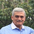
Commits alumnus Ajay Kurpad (Class of 2011) joined Saatchi&Saatchi Focus in Bangalore as a copywriter last November. And he already has some sterling campaigns to his credit. The most recent? Something he did for Bosch, the technology and services company. Here Ajay explains how he went about his task:
 |
| AJAY KURPAD |
Every year, during the first quarter of business, Bosch organises an event called ‘Proteam’ for its employees from all over the country. This three-day affair, which the company hosts in recognition of the employees' hard work, is usually conducted in lavish style at a spectacular location. This year was no different. Like every year there was a theme around which the whole event would revolve.
THE TASK
The theme of Proteam 2011 was "Superheroes". So, as part of the creatives, we at Saatchi were asked to design "standees". These standees are posters which are mounted on stands and placed at crucial points around the venue where they get maximum visibility. The standees had to link the Bosch Automotive Aftermarket products to Superheroes.
The theme of Proteam 2011 was "Superheroes". So, as part of the creatives, we at Saatchi were asked to design "standees". These standees are posters which are mounted on stands and placed at crucial points around the venue where they get maximum visibility. The standees had to link the Bosch Automotive Aftermarket products to Superheroes.
THE PROCESS
Step 1: The first step was to find the best superheroes to fit each product. This involved hours of work and research in the world of Marvel and DC. Finally we chose Flash, The Human Torch, Iceman, Black Bolt, Wolverine, Aquaman, The Green Lantern, Black Lightning, Jean Grey, Mr Fantastic, and Spiderman. At the end of it, it took me a superhuman effort to actually like any superhero any more. But all said and done, we did a good job. We then put everything together as a PPT presentation and sent it to Bosch. Fortunately, the company approved it in the first go.
Step 2: The copy had to
substantially prove why a certain product was like a particular
superhero. That was not hard, though. All I had to do was link the
superpower to the product’s USP. This is where the use of flowery
language and a talent for beating-round-the-bush came in handy.
In the meantime, P.P. Mani, my art director went about scouting for images of all the shortlisted superheroes. Then, with the power of Photoshop and Illustrator, he made them even more macho.
Step 3: With idea in place, copy in hand, and images ready, we started the linking process. Initially we thought of just following standard procedure of juxtaposing the product and the superhero. However, the art director decided to take it to the next level. He thought of incorporating the product in such a way that it would look more visually appealing.
The end result:
 |
| The Flash, one of 11 superheroes used in the campaign. |
Each artwork was 8
ft x 4 ft and was displayed along the corridors of The Leela, Kovalam,
during the event. People were actually posing next to them and clicking
photos. As you can imagine, a lot depended on the art and my art
director — who has been with Saatchi for almost 17 years — got
it spot on. Eventually, I ended up managing most of the campaign,
except for the film, for which I just about made some contributions at
the script level.
- ALSO READ: "What creative advertising really means".


